PROJECT
Designing Complex Assessment Interactions
COMPANY
Get more brain
ROLE
UIUX Designer
TEAM
Product
TOOL USED
Figma
Overview
About this project
Educational platforms often include multiple-response assessments where learners can select more than one answer. While the interaction appears simple, communicating results becomes significantly more complex when responses are partially correct, partially incorrect, or contain a mixture of both. This project focused on redesigning the assessment experience to make answer selection, result interpretation, and learning feedback easier to understand. The goal was not only to help users identify whether they were correct or incorrect, but also to clearly explain why, creating a more effective learning experience.
Design Process
The project began with research into existing assessment experiences across educational and quiz platforms, including Google Forms, Quizlet, Quizizz, Typeform, and Duolingo. After analysing common interaction patterns, I mapped every possible response scenario that could occur within a multiple-response assessment. This included combinations of correct answers, incorrect answers, missed answers, and partially correct submissions. Working closely with the product team and subject-matter experts within the company, I developed a structured evaluation framework before exploring multiple interface approaches. The final solution combined accessibility best practices, clear feedback mechanisms, and scalable design-system principles to create a consistent assessment experience.
Research
Design exploration / IA
Low fidelity wireframes
Design system / High fidelity
Test/Review/Launch
Challenge
Unlike traditional single-answer quizzes, multiple-response assessments create a wide range of possible outcomes. Learners may answer completely correctly, partially correctly, or select a mixture of correct and incorrect responses. The challenge was to communicate these outcomes clearly without relying solely on colour, while ensuring learners understood both what they selected and why their answer was correct or incorrect. Because the ultimate goal of educational assessments is learning rather than grading, the experience also needed to provide meaningful feedback that helped users improve their understanding.
Outcome
Delivered a structured assessment framework capable of handling multiple-response scenarios while improving clarity, accessibility, and learning feedback. The redesigned experience guides users through answer selection, result review, and feedback in a clear and consistent way. By combining visual indicators, contextual explanations, and accessible interaction patterns, learners can better understand both their performance and the reasoning behind each result. The framework was enthusiastically received across the team and established a scalable foundation for future assessment experiences across the platform.
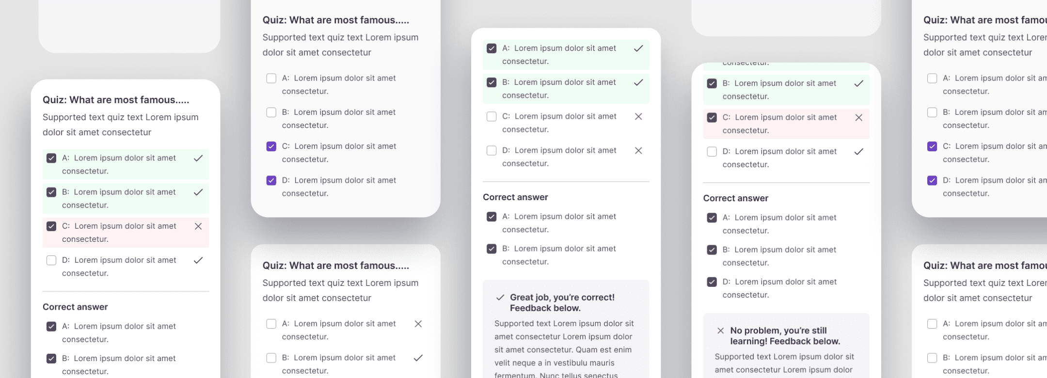
Improvement
The completed assessment experience integrated within the learning notebook environment

Assessment Logic Framework
Mapping every possible answer state before exploring interface solutions.

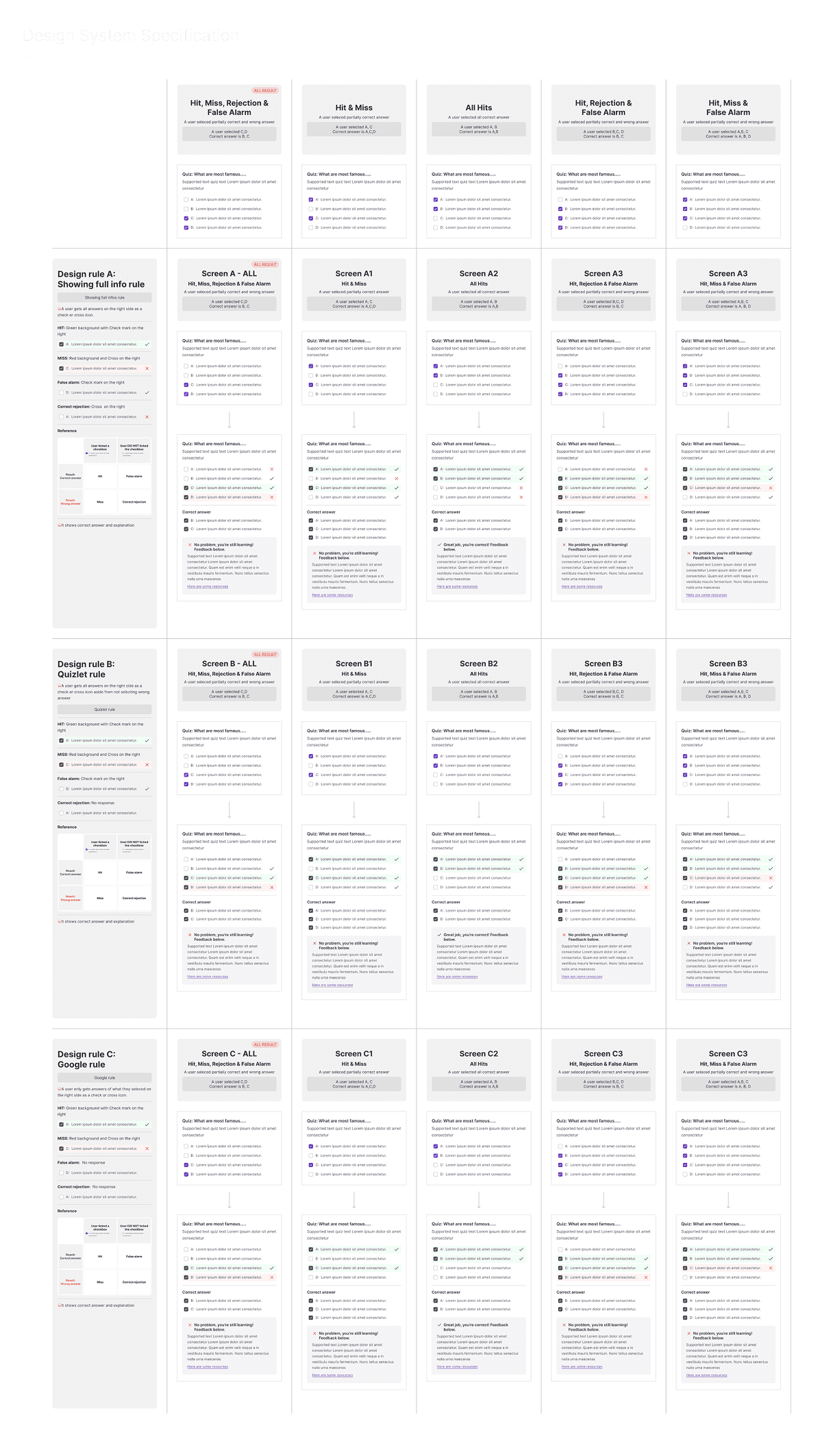
3 Design rules: Evaluating Design Approaches
Comparing three different methods for communicating assessment results and feedback.

Final Design Specification
Translating assessment rules into scalable UI patterns and interaction states.
From Selection to Learning Feedback
Comparing the original interaction flow with the redesigned learning-focused experience.
